
Personal Brand Logo and Business Card
- Nov 27, 2017
- 4 min read
This next assignment for my Portfolio class required me to develop my own brand logo and business card. After researching and gathering ideas, I was able to create a design that represented who I am professionally. Below are the tasks I had to complete: research, designing the logo, designing a business card.
Part I: Research and Develop your Ideas
(For the first part, I was to find inspiring logo designs and address prompts given in the assignment.)
Schurz Communications Inc
This logo is appealing to me because of its symmetrical and circular shape. If you cut the logo in half horizontally, both sides are the same.
What makes me connect with this logo is the way it uses letters to make a unique design. Even though it’s only the company’s initials, it was created in a tasteful way that is clever and easy to recognize.
In this design, it uses a centered alignment. It is not all over the place and your eye can follow it easily. It also demonstrates proximity by having the large logo as the focal point. The eye is drawn first to the logo and then gradually moves downward to the brand name.
B Music Brand
This logo is appealing because of its simplicity and clever use of a serif font and music note. I like how they incorporated the use of a musical note as part of the stem of the B. It isn’t too overpowering and it gets the message of music across efficiently.
I connect to the musical aspect of this logo. The way it includes the eighth note makes it clever and visually appealing. With my logo, I hope to do something similar by adding some sort of simple imagery that connects with music.
This represents the principle of contrast. The way it does that is with the differences in the line weight. The stem of the B is much thicker in comparison with the musical note. The line goes from thin to thick back to thin on the bumps of the B.
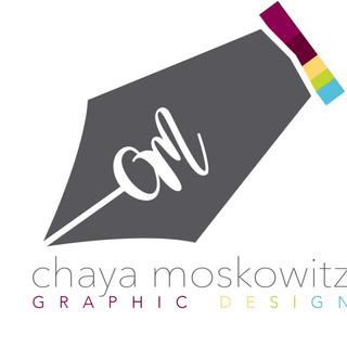
Chaya Moskowitz
For this final logo, the color scheme and imagery are appealing to me. I love the bright, happy colors that represent this graphic designer. Also, the icon of the quill pen with their initials gives it a personal, artistic flair.
What I connect to with this logo is the pen design. It is easy to recognize and the viewer can easily connect it with a writer or designer, which is something I hope to add to my logo.
When first looking at this design, your eye is drawn immediately to the large quill pen logo, demonstrating proximity. The designer wants you to look at the icon first and then gradually move down and see what it means and who it’s for.


Part II: Creating the Logo
My logo is filled with different icons to represent who I am. The letter “s” is actually a slightly contorted Treble Clef, like in music. For the “R” (or “F”) There are a quill pen and a paint brush to symbolize me as a writer and a visual artist.
Frankly, I designed this logo before this class but made some adjustments and tweaks. However, the logos I found above are similar to a few references I used. The second logo of the B as a music note is similar to what I tried to accomplish with the S as the Treble clef. The third logo with the quill is close to the way I had designed the pen in my logo.
My logo was created in black and white so it could be changed and used to my liking. However, the color it is most commonly seen in is Grape (#451f54). Not only is it one of my favorite colors, but it is also one that I use for everything: my resume, my website, and so on. The reason for that is because of the image usually associated with my brand, my digital drawing “Chapter 24”.
As stated in the first response, my logo is full of icons to represent who I am. I wanted a cleverly designed, attractive logo to show my creativity to whoever sees it. I also wanted something unique to identify me with. It's fun, different, and inquisitive. My logo was originally created with my pseudonym initials (S.F.), but now I realize that it may have not been the best choice. Although I truly like the look of my logo, I understand that I need something that represents my legal name. So, I changed the “F” to an “R”. However, I won’t scrap the first one. That logo is everywhere (on my printed business cards, the backs of my books, etc.) So, I will use my SR logo for my resume and portfolio, but keep my SF one for everything else.
Part III: Designing a Business Card

For this new business card, I made sure to use my legal name (the original ones I have printed have my pseudonym). I have simple contact information, my portfolio, and author site. I was thinking of adding my phone number, but my preferred method of contact is email. As for the design, I wanted to keep it consistent with my brand. So, I have my new SR logo in the background that looks through to my signature “Chapter 24” image. The black background makes the text pop and the purple and blue colors seem mysterious. The font choices are “Montserrat”, the same used on my Portfolio site. This business card, I think, does a good job of portraying my brand and giving individuals a glimpse of who I am.
Comments